Chart: 2D Map (Start table list)
Summary
Show selected data in a color map. The horizontal axis can show time duration or lengths. Start table must be a list with the following column types: Identifier, Date + time (from), Date+ time (to), Values.
Example: ...
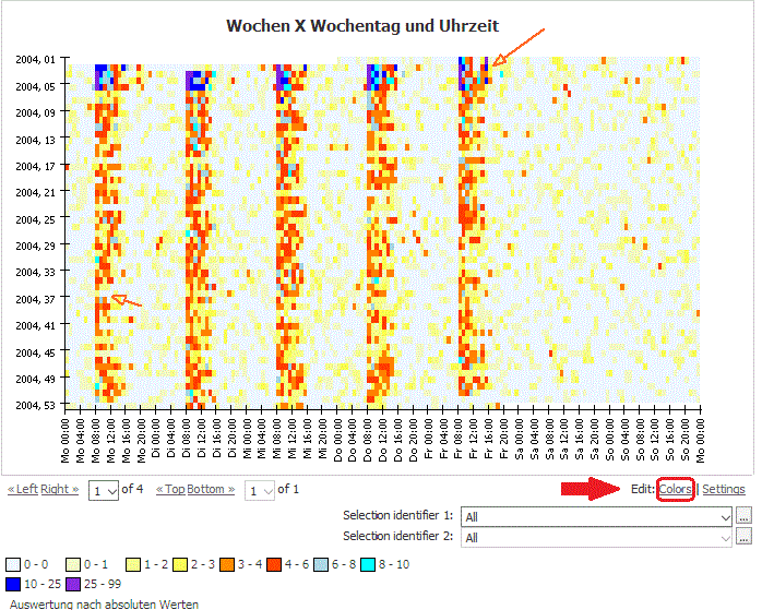
Situation | This data of demand are to be visualized. For comparing weeks a helper week is calculated, which is available for a common time.
| ||||||||||||
|---|---|---|---|---|---|---|---|---|---|---|---|---|---|
Settings | Add an operator with following settings
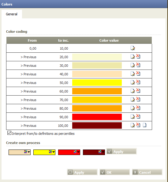
Farbcodierung einstellen
| ||||||||||||
Result |
| ||||||||||||
Project-File | ... |


Want to learn more?
Settings
Show selected data in a color map. The horizontal axis can show time duration or lengths. Start table must be a list with the following column types: Identifier, Date + time (from), Date+ time (to), Values.
Columns of input table
Parameter
Examples
Example 1: ...
...
Calculation method | Settings | Result |
|---|---|---|
... |
|
|
Troubleshooting
Problem | Frequent Cause | Solutions |
|---|---|---|
... |
| ... |
Related topics
- ...