Chart: Standard types 2.0
Summary
Show selected data in a chart. Different standard charts are available for selection, such as columns, bars, lines, histograms, etc.
Example: Plot employee count over time in two different stores
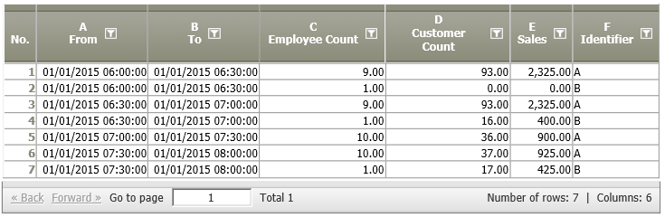
Situation | The following data node contains data from two stores (A and B). The employee count in each store shall be plotted over time of day.
|
|---|---|
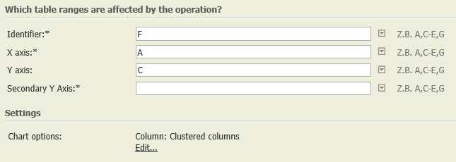
Settings | In the operation, the identifier F, time (A) and the values to be displayed (C) are entered.
|
Result |
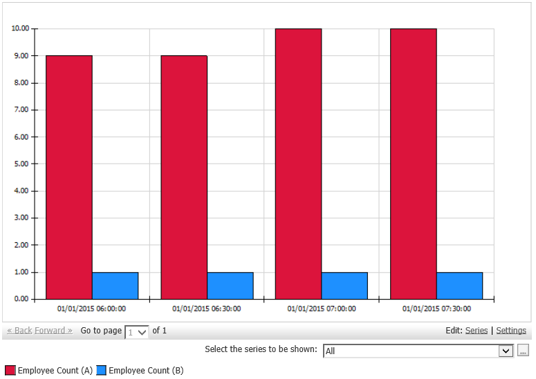
It is possible to try out different chart options, e.g., line diagram, stacked bars, etc. With "settings" (bottom right), the chart can be formatted further. |
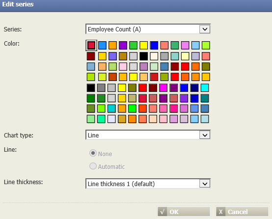
Chart formatting |
|
Project-File |

Want to learn more?
Settings
Show selected data in a chart. Different standard charts are available for selection, such as columns, bars, lines, histograms, etc.
Columns of input table
Parameter
Troubleshooting
Nothing known yet.
Related topics
- Other chart types: Chart: Histogram, Chart: Gantt 2D, Chart: XY Scatter, Chart: Histogram Time Pattern
- How to display a chart in TIS Board: Chart (Portlet)