Plotly chart
Via HTML (Portlet). Allows to display any chart which can be created with plotly:
Prerequisites
Add pandas + plotly to your deployment settings.xml
<Python>
<Packages>
<Package>pandas</Package>
<Package>plotly</Package>
</Packages>
</Python>
Extract plotly_chart.zip and add it to your branding in tisconfig:

Creating a plotly chart in editor
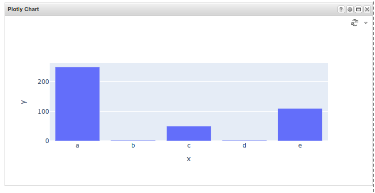
Based on the data you want to display (in this example a categorical X axis and a few Y values are used):
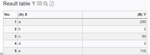
This input table will be consumed by a Python script which creates Ploty JSON data in lines x to y. This JSON is split up into single rows for the Plotly portlet. This lines could be saved in a TIS Table for later use.
import plotly.express as px
def simple_main(params, mylist, types, columns):
x_values = []
y_values = []
for row in mylist:
x_values.append(row[columns['X']])
y_values.append(row[columns['Y']])
fig = px.bar(x=x_values, y=y_values)
#fig = px.line(x=x_values,
# y=y_values,
# title="What a wonderful chart title")
result_visualization = fig.to_json()
JSON_CHUNK_LENGTH=1000
result_chunks = (result_visualization[i:i+JSON_CHUNK_LENGTH]
for i in range(0, len(result_visualization), JSON_CHUNK_LENGTH))
columns.clear()
columns.update({
"row_nr": 0,
"result_chunk": 1
})
types.clear()
types.update({
0: int,
1: str
})
mylist = []
# fill in output list
for row_nr, result_chunk in enumerate(result_chunks):
mylist.append( [row_nr, result_chunk])
return mylist
Remove the first column, which is only for sorting, when writing to a TIS Table.
To consume this data, create a HTML (Portlet) with the following settings:
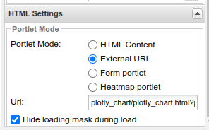
URL: plotly_chart/plotly_chart.html?projectname=TIS Project Name&DN=a02 show plotly chart
- projectname: The name of the TIS project with the python script
- DN: The name of the datanode of the plotly JSON result (either directly from the Python script or read from a TIS Table).