HTML Form
9
Introduction
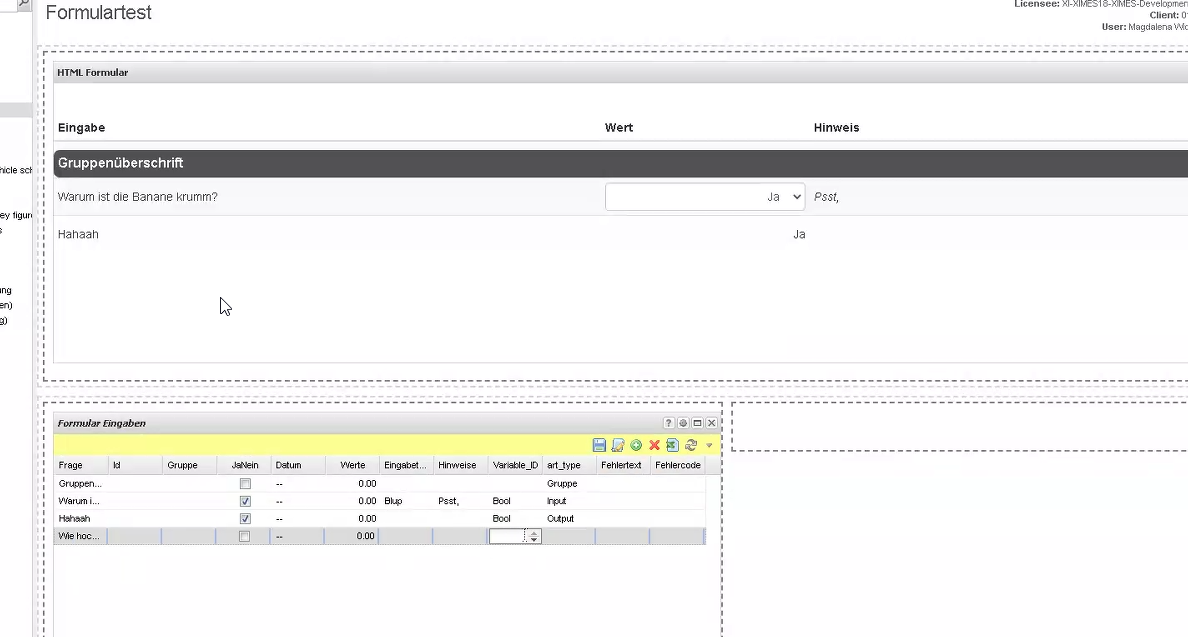
Starting from v 6.9 via HTML (Portlet). The HTML Form provides a user interface to enter data in a form-based way.
It allows to add explanation text and validation error messages.
It is possible to define selection lists and compound input fields, e.g., a set of integers or a set of timestamps.
A full list of input options can be found here Data types in HTML Form
Core steps to setup HTML-Forms
|  |
|---|---|
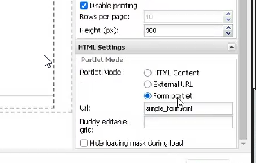
| The HTML Form is created from a definition that has to be provided in an Editable Grid portlet. The portlet has to be referenced as "Buddy editable grid" in the settings of the HTML Portlet.  |
| It is possible to hide header row and set base color and width of the columns in Form settings.  Alternatively, these settings can be added manually through the URL: Note: Settings added through URL will overwrite the settings added through the form. |
Columns of the Editable Grid
The Editable Grid contains the definition of the form items or sections as follows.
Columns indices are relevant rather than column names, so the column names can differ between applications.
More columns can be added for other purposes, e.g., error handling.
Column index | Common column names | Description | Screenshot |
|---|---|---|---|
0 | Title Frage | Header of the form items |  |
1 | ID Id | Identifier of the item for internal use. | n/a |
2 | Group Gruppe | Group name, if the item belongs to a group. The group name has to be defined in a separate row. |  |
3 | Value Bool or NullableBool | Boolean value that is read if data type |  |
Boolean value that is read if data type | Then the box is empty at the beginning thereby allowing to distinguish, whether false=Nein | ||
4 | Value DateTime Datum | DateTime value that is read if data type in column | n/a |
5 | Value Float Werte | Float value that is read if data type in column "Variable ID" (“Data type“) is | n/a |
6 | Value String or Selection Eingabetext | String value that is read if data type in column "Variable ID" (“Data type“) is | n/a |
String value that is read if data type in column "Variable ID" (“Data type“) is " The chosen val_id (= nr) is - after a selection in the Column "Werte". See code below for generating the dictionaries easily out of a comma separated list. | Text in column "Eingabetext" as a python- list with dictionaries [ leads to:  | ||
7 | Infotext Hinweise | In |  |
For |  | ||
Graphics ans Hover can be inserted with SVG: Gib einen <svg xmlns="http://www.w3.org/2000/svg" width="16" height="16" fill="none" viewBox="0 0 24 24" stroke-width="1" stroke="currentColor" class="size-1"> <path stroke-linecap="round" stroke-linejoin="round" d="m21 7.5-9-5.25L3 7.5m18 0-9 5.25m9-5.25v9l-9 5.25M3 7.5l9 5.25M3 7.5v9l9 5.25m0-9v9"></path></svg>Prüfungszeitraum <svg xmlns="http://www.w3.org/2000/svg" xmlns:xlink="http://www.w3.org/1999/xlink" version="1.1" width="16" height="16" viewBox="0 0 256 256" xml:space="preserve"><title>In diesem Zeitraum können im nächsten Schritt Arbeitszeiten eingegeben werden</title><defs></defs><g style="stroke: none; stroke-width: 0; stroke-dasharray: none; stroke-linecap: butt; stroke-linejoin: miter; stroke-miterlimit: 10; fill: none; fill-rule: nonzero; opacity: 1;" transform="translate(1.4065934065934016 1.4065934065934016) scale(2.81 2.81)"><path d="M 45 0 C 20.147 0 0 20.147 0 45 c 0 24.853 20.147 45 45 45 s 45 -20.147 45 -45 C 90 20.147 69.853 0 45 0 z M 49.083 68.404 C 47.884 69.469 46.389 70 44.597 70 c -1.792 0 -3.288 -0.531 -4.486 -1.596 c -1.199 -1.063 -1.798 -2.424 -1.798 -4.082 c 0 -1.657 0.599 -3.018 1.798 -4.082 c 1.198 -1.064 2.693 -1.596 4.486 -1.596 c 1.792 0 3.287 0.532 4.486 1.596 c 1.199 1.064 1.799 2.425 1.799 4.082 C 50.882 65.98 50.282 67.341 49.083 68.404 z M 59.718 38.381 c -0.739 1.524 -1.928 3.081 -3.562 4.671 l -3.864 3.595 c -1.099 1.053 -1.861 2.133 -2.285 3.242 c -0.425 1.109 -0.66 2.515 -0.706 4.217 h -9.61 c 0 -3.271 0.369 -5.852 1.109 -7.746 c 0.739 -1.893 1.937 -3.533 3.595 -4.923 c 1.658 -1.388 2.918 -2.66 3.781 -3.813 c 0.862 -1.154 1.293 -2.425 1.293 -3.814 c 0 -3.382 -1.456 -5.074 -4.368 -5.074 c -1.344 0 -2.431 0.493 -3.259 1.479 c -0.829 0.986 -1.266 2.318 -1.311 3.999 H 29.174 c 0.044 -4.48 1.456 -7.969 4.234 -10.467 C 36.185 21.249 40.083 20 45.101 20 c 4.996 0 8.865 1.154 11.609 3.461 c 2.745 2.308 4.116 5.59 4.116 9.846 C 60.826 35.166 60.457 36.858 59.718 38.381 z" style="stroke: none; stroke-width: 1; stroke-dasharray: none; stroke-linecap: butt; stroke-linejoin: miter; stroke-miterlimit: 10; fill: rgb(0,0,0); fill-rule: nonzero; opacity: 1;" transform=" matrix(1 0 0 1 0 0) " stroke-linecap="round"></path></g></svg>The “Usage” has to be set to “Output”. |  | ||
8 | Data type Variable_ID | Data type of the item. | n/a |
9 | Usage art_type | Usage of the item. One of
|
|
10 | Error text | Text that is displayed in red letters below the info text of column 6 |  |
11 (New in 7.1) | Row style | String which specifies the CSS class styling of a row. | Default styles:
Value
Multiple styles can be added when separated by a space, e.g. |
Example Editable grid
That’s how it may look like |  |
|---|---|
Paste it in an Edit TIS Table 4.0 | Title ID Group Bool DateTime Value Float String or Selection Infotext DataType Usage ErrorText RowStyleMy first form 0 01.01.1900 00:00:00 Gruppe Name 0 01.01.1900 00:00:00 String Input Nr 0 01.01.1900 00:00:00 String Input |
Advanced Settings
The form in simple_form.html is delivered by TIS. It can be customized in TISBoard/portal/simple-form/custom.css for branding (added to tisconfig).
Additional Infos
Generate the code for Selection out of comma separated text
Generate dictionary out of comma separated list
""" Für Elearning Aufbau der spezifischen Spalten"""#C:\Repository\calculex\AZR_220828_simple_mains_und_Reste\simple_main_EL_Selection aufbereiten.pyimport jsonSPALTE_SELECTIONSTEXT = 'Eingabetext'SPALTE_GRUPPE = 'Variable_ID'def simple_main(params, mylist, types, columns): """Baut Spalteninhalt für SELECTIONSAUSWAL HTML FORM auf.""" col_gru = columns [SPALTE_GRUPPE] col_sel = columns [SPALTE_SELECTIONSTEXT] # Werte in entsprechende Spalte for row in mylist: if row[col_gru] == 'Selection': txt = row[col_sel] liste_werte = (txt.strip()).split(',') # liste_werte = ['-'] + (txt.strip()).split(',') # adds the value - at the beginning of the list, so nothing is selected automatically. res = json.dumps( [ { "val_id": f"{i}", "val_text": el} for (i, el) in enumerate(liste_werte, 1)]) row[col_sel] = res return myl""" ZIELFORMAT[{"val_id" : 1, "val_text" : "Woche"},{"val_id" : 2, "val_text" : "Monat"}][{"val_id" : 1, "val_text " : "x08:00"},{"val_id" : 2, "val_text " : "x05:30"},{"val_id" : 3, "val_text " : "x09:00"}]"""
