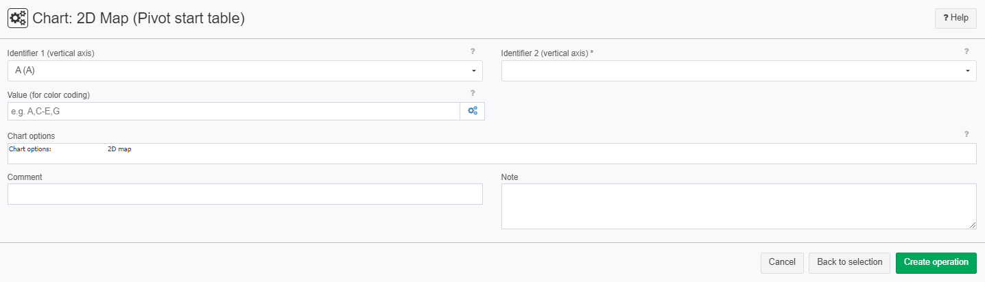
Chart: 2D Map (Pivot start table)
Summary
Show selected data in a color map. Start table must be a pivot table with the following column types: Identifier 1, Identifier 2 (optional), Values (several columns).
Configuration
Input settings of existing table
Name | Value | Opt. | Description | Example |
|---|---|---|---|---|
Identifier 1 (vertical axis) | System.Object | - | Which columns should be evaluated for the identifier? | col1 |
Identifier 2 (vertical axis) | System.Object | opt. | Which columns should be evaluated for the identifier? | col2 |
Value (for color coding) | System.Double | - | Value columns from the pivot table that are shown on the horizontal axis as individual points and whose values are color coded. | col3 |
Settings
Name | Value | Opt. | Description | Example |
|---|---|---|---|---|
Chart options | System.String | - | Settings for the chart, such as title, axis labeling, etc. | - |
Remarks
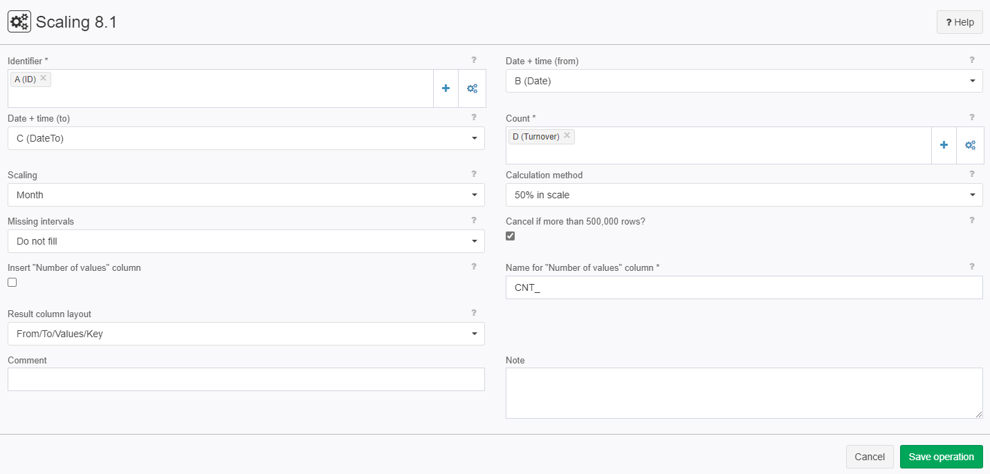
Before using the Create pivot table 5.0 operator on your data use the Scaling 8.2 operator to ensure that there aren't any holes in the data.
Want to learn more?
Screenshot
Examples
Example: Creating a chart
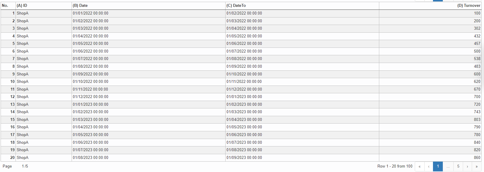
Situation | This example shows you how to make a 2D Map. In the table are 5 shops from A-E and the turnover they've made over a set time. Import this file using Import from Excel file: Here is an example of "ShopA":
|
|---|---|
Settings | After importing the file we need to use the Scaling 8.2 operator on our table to make sure there are no holes in our table. our Scaling is in moths because out data was also provided in months:
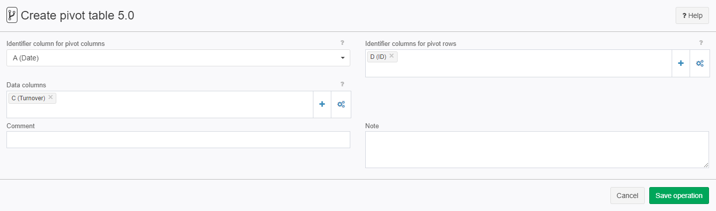
Now we need to create a pivot table using the Create pivot table 5.0 operator.
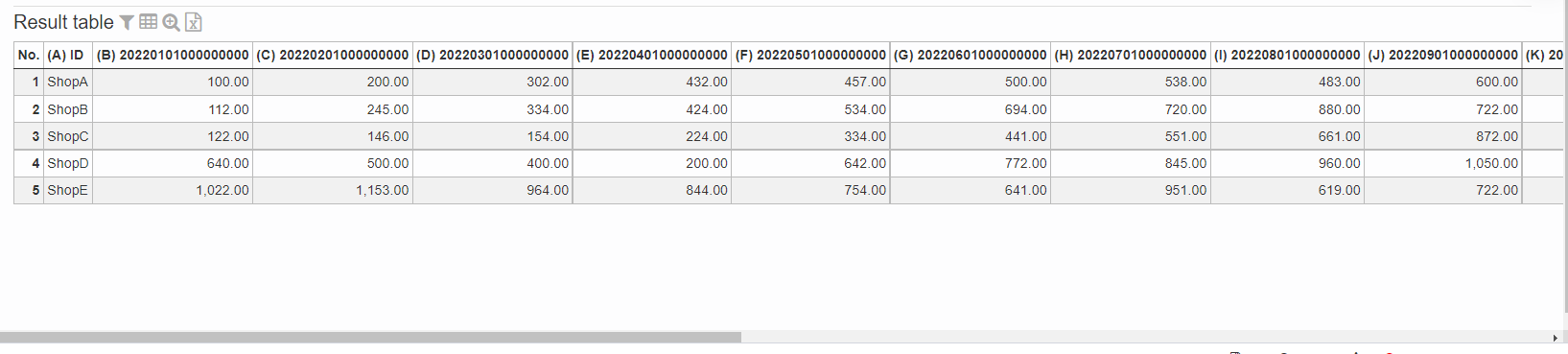
The result of Create pivot table 5.0 looks like this:
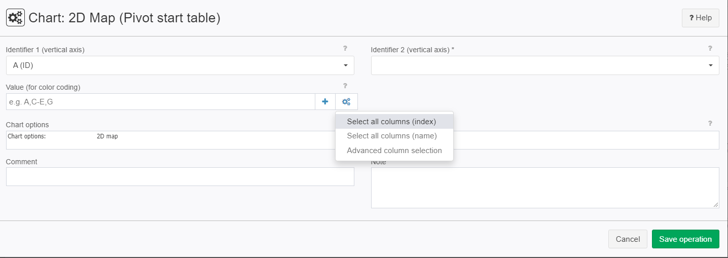
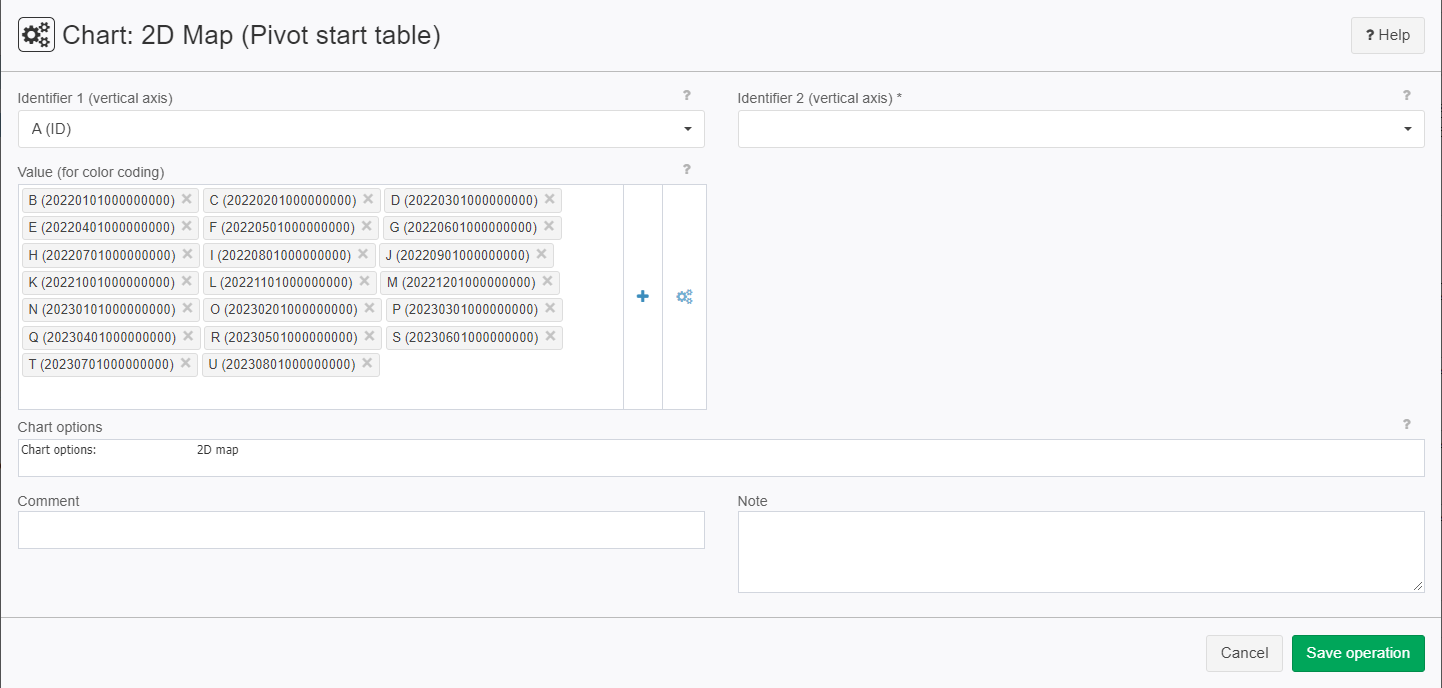
The column headers are our dates and each row represents the monthly turnover of a shop. Now we can make our 2D Map using the operator "Chart: 2D Map (Pivot start table)":
|
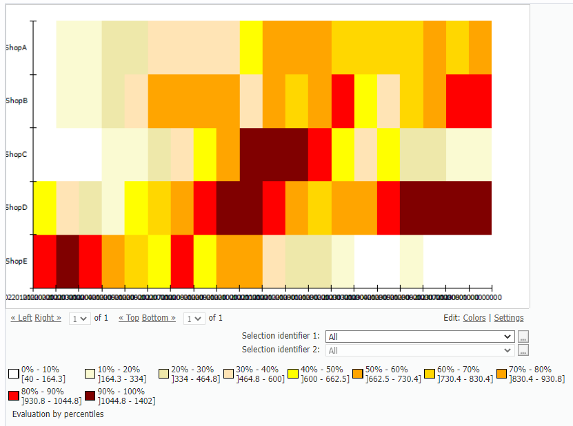
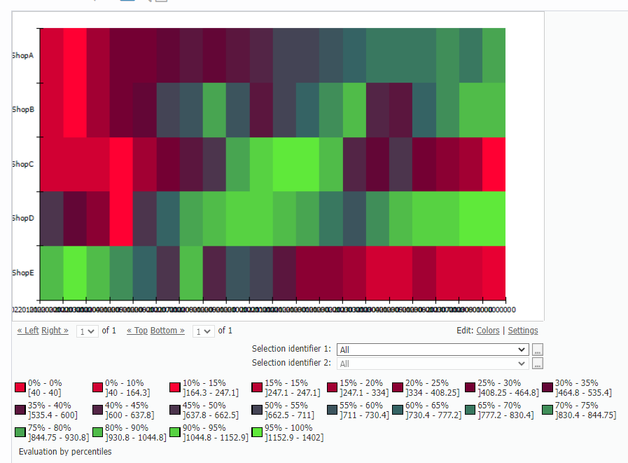
Result | Each row represents the monthly turnover of a shop just like in the pivot table but it is being visualized in a chart.
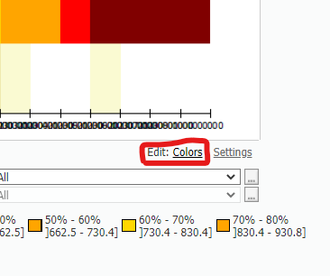
But to be honest that doesn't look very eye catching, but we can change that using the color settings option in the bottom left.
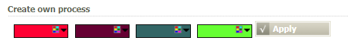
You can even generate you own color process just like I did.
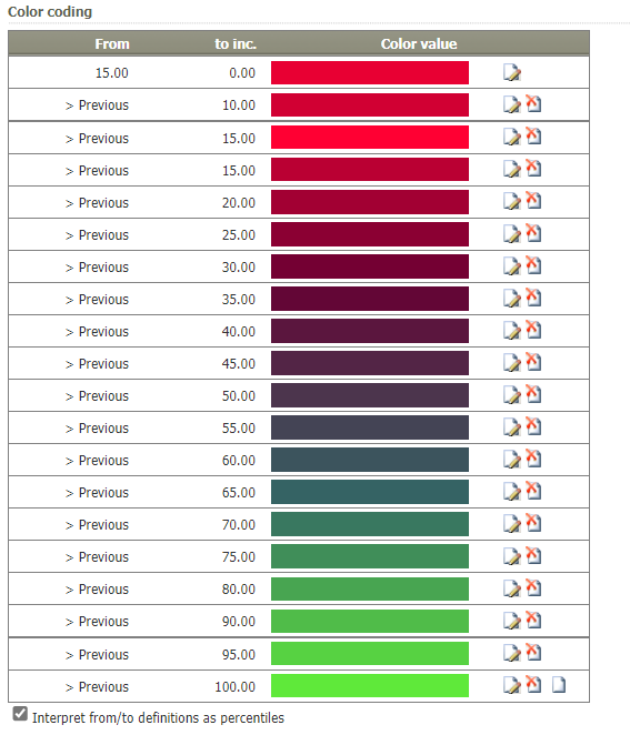
After pressing apply the color palet looks like this:
Lets see how it looks on our chart:
Now you can see if the shops where successful just by taking a glimpse at the chart! |
Project File | - |
Troubleshooting
Nothing known up to now.